And if you still haven’t got your things in order — perhaps, these are the details you were missing? Check out these cool new features!
Shading effect instead of ellipsis for long tasks
Although personal effectiveness coaches teach that task names should be as short and concise as possible, sometimes you have long ones. Before, very long names were hidden behind ellipsis. Now, instead of ellipsis, there is spectacular shading.

Pinned header on all pages
When you work in Google tables, the length of which exceeds the height of the screen, you want to fix the first row so as not to lose the names of the columns when scrolling. When you work in the SingularityApp application, you also want to constantly see which section you are in, no matter how far you scroll down. We fulfill the wish — now the section title is always fixed at the top.

Some icons have moved
Previously, the custom sorting icon was under the folder name. Now it’s in the right corner, just below the top toolbar. And there is no more Filter By Tags icon — now, if you want to use the sorting filter, just click on the tag icon in the upper toolbar. In the pop-up window (that appears on the right), you can easily find the sorting filter you need.

By the way, if you hold down the Shift key on your keyboard, you can select several tags at once. And the selected ones will be displayed in the header of the current page. To reset the settings, you need to click on the X next to the tag in this area.

Date and time of tasks — always displayed
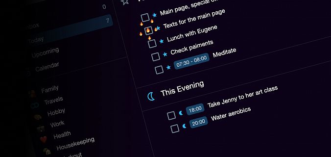
The checkbox for tracking overdue tasks has also been moved to a new tab Interface. Previously, if you enabled this option, a gray asterisk was displayed next to overdue tasks, and to see the overdue date, you had to open the task for editing. Now, the date and time are always shown for unfinished tasks. When the expiration tracking option is enabled, the dates appear in different colors depending on how much they are overdue. If this option is disabled, the date is grayed out for all overdue tasks.


And for dessert
Minimizable notes
Now project notes can be minimized, and the application will remember whether they are minimized or not when you come back to this section again.
Remembering the sorting
The application remembers that in each project and in each system folder you have your own sorting and will show everything the way as you left it the last time (even after restarting the application).
We appreciate feedback from our valued users, so if you want to improve something in SingularityApp — do not hesitate, email us.
New releases are coming.


